
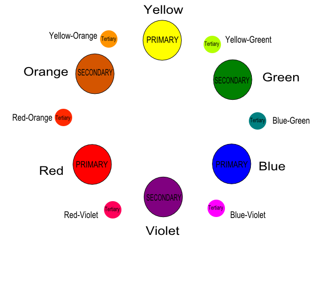
Color Wheel Assignment:
Use Inkscape to create the color wheel shown above. Your work will be graded using the following criteria:
1. Primary & Secondary color codes were matched correctly. 6 points
2. Tertiary colors are present on the wheel. 6 points
3. Each Primary, Secondary, & Tertiary circle has a 'color' & 'type' label. 24 points
4. Color wheel is neat and reflects the example given. 2 points
5. File was saved with the PROPER file name:
LastnameFirstname_GD#_Color wheel. 2 points
TOTAL = 40 points possible
| foster_color_wheel_student.svg |
| ghostface.docx |
| green_frog.docx |
| cricket.docx |
| brownbrother.docx |
| pacman.docx |
| monkey.docx |
| path_operations_and_pen_tool.docx |
| inkscape_icon_pencil_tool.svg |
| oscar_the_grouch_fill_tool.svg |
| cloud_rain_scene.svg |
| what_is_graphic_design_ppt_questions.docx |
Reflection Directions: Click on the button link below. Choose 'Save As' in the pop-up window. Save as GD#_LastName_FirstName_PosterReflection.
Week of 2/24-28/2014
Week of 3/3-7/2014
After viewing the assignment above, open the document below & SAVE AS GD#_LastName_FirstName_Identity Questions. Keep it on your flashdrive!
| letterhead_template.svg |
| business_card_template.svg |
| envelope_template.svg |
Week of 3/10-14/2014
Shoe Design Project: After completing the Pen Tool Practice under 'Mrs. Foster's How-to', choose and download one of the shoe files below. Save it to your flash drive & begin tracing it using the Pen Tool in Inkscape. You may then design the shoe's components to your liking.
| air_force_one.jpg |
| air_max.jpg |
| high_top_nike.jpg |
| high_top_chuck.jpg |
| low_top_chuck.jpg |
| baseball_cap_lineart.png |
Week of 3/17-21/2014
Pictures or images inside of text. Watch the video under "Inkscape Resources". Open Inkscape and demonstrate the skill using your last name and an image file of your choice. See a few examples below:
This week's skill "Pictures in Text" can be applied in many ways; one of which is fashion design. Fashion drawings are called "flats". Designers use detailed fashion flats to visually communicate their clothing designs to manufacturers and/or individuals. Flats include all information including pockets, seams, threads, colors, and shapes. See the image below.
In fashion design, material is depicted through the use of fabric "swatches". Swatches are visual representations of the fabric you would like to use in your actual garment. In this project, you will use the "Pictures in Text" skill to save a swatch to your flash drive. Next, you'll import the swatch to Inkscape, convert swatch object to a pattern, and apply the pattern to your garment to your liking.
DIRECTIONS: Save the following link "Fashion Design Flats" to your flash drive. Open the file through Inkscape. Choose one garment to trace using the Bezier Pen Tool. Finish your design by adding details like material and text. Use the "Pictures in Text" skill to save a swatch to your flash drive. Next, import the swatch to Inkscape, convert swatch object to a pattern, and apply the pattern to your garment to your liking. Save your final work as GD#_Last Name_First Name_Beginning Fashion.
| fashion_design_flats.svg |
| flat_project_template.svg |
Week of 3/24-28/2014
After viewing the project slides below, open and SAVE the "idrawing project" file below. Save it to your flash drive and DO NOT change the name!
| idrawing_project.svg |
Week of 3/31-4/4/2014
Mrs.
Foster’s Blog
1. Watch the 1st TWO videos!
Assignment Links & Videos
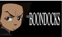
1. Read about The Boondocks
2. Click on "Boondocks Comic Strips" to view past comic strips from the series.
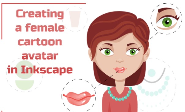
3. Begin the "Creating a Female Cartoon Avatar" tutorial. Save it to your flash drive as: FEMALE AVATAR.
1. Watch the 1st TWO videos!
Assignment Links & Videos
1. Read about The Boondocks
2. Click on "Boondocks Comic Strips" to view past comic strips from the series.
3. Begin the "Creating a Female Cartoon Avatar" tutorial. Save it to your flash drive as: FEMALE AVATAR.
"I am the stone that the builder refused
I am the visual, the inspiration, that made Lady sing the blues
I'm the spark that makes your idea bright
The same spark that lights the dark so that you can know your left from your right
I am the ballot in your box, the bullet in the gun
The inner glow that lets you know to call your brother 'son'
The story that's just begun
The promise of what's to come
And I'ma remain a soldier till the war is won
Judo flip! Chop chop chop! Judo flip! Chop chop chop!"— Asheru, Opening Theme
Aaron McGruder's newspaper strip, involving two African American brothers (the politically minded Huey and wanna-be gangster Riley Freeman), who move from inner-city Chicago to live in the fictional suburb of Woodcrest, with their cranky grandfather, Robert.
The comic strip largely began as a "Fish out of Water" theme, dealing with Huey and Riley adjusting to life in the predominantly white town of Woodcrest. Huey serves as the main character of the series, with Riley as his comedic foil. The two characters serve as political opposites for each other: Huey Freeman is intelligent, radically political, and has a rather cynical view on life. This eventually drives him to write his own newsletter where he vents his frustrations towards the black community with help from his best (and far more moderate) friend Caesar. Riley, on the other hand, is a wannabe thug and prolific schemer. What he lacks in social consciousness, he is more than willing to make up for in threats of violence. Their caretaker is Robert "Granddad" Freeman; a hardline disciplinarian who is quick to use his belt to keep his grandchildren in line. Though the cliché of the old, out of touch grandparent, various strips show "Granddad" as being a somewhat lecherous old man who hides his own wild side for the purposes of providing his grandchildren a strong parental figure.
Other characters introduced in the comic strip include Tom Dubois, a successful, politically mainstream black lawyer who works for the district attorney's office, who serves as a foil for the cynical Huey. Much of the humor of the strip comes from the idealist Tom interacting with the cynical Huey, who views Tom as a sell-out due to his rather passive nature. Huey also has an adversarial relationship with Tom's biracial daughter Jazmine, whose overwhelming naiveté makes her believe everything she is told by adults.
The comic strip was widely unknown until after the events of 9/11 when the strip gained national attention for McGruder's decision to have the series directly address the political aftermath of the attacks as far as bringing attention to the claims that ties that existed between the Taliban, Osama bin Laden and the Republican Party, of which members of the Reagan administration (later part of the Bush Administration) had helped fund and train Taliban and bin Laden in the 1980s to fight the then-invading Soviet Union. The strip itself also took a very critical stance against George W. Bush and his handling of the aftermath of 9/11, something very few people in the media were willing to do. This made the series a darling of Bush's critics and made McGruder famous.
For those of you who missed the comic (which ran nationally from 1999 to 2006) you can find it here.
Spawned a successful animated version on [adult swim], which has caused no small amount of conflict due to its lessened emphasis on topical political references (which would have been impractical considering the extended production and turnaround time when compared to the comic). It instead focused on critiquing and satirizing long-standing controversies within both black and mainstream American society, as well as expanding or changing several of the characterizations, and adding in a few kung fu fights for kicks. For this, the animated series can be considered to be in an alternate continuity from the comic. Note that a lot of the tropes on this page apply to one or the other (and the TV show seems to be better represented).
*Taken from http://tvtropes.org/pmwiki/pmwiki.php/ComicStrip/TheBoondocks
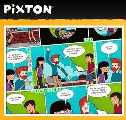
Comic strips are a GREAT way to blend graphic design with reading and writing! It's creative and you can have fun at the same time. Did you know that some of your favorite cartoons on TV started as a comic strip? Use one of the apps here to try your hand at creating your own comic strip.
Week of 4/7-11/2014
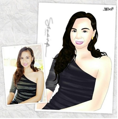
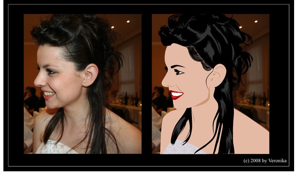
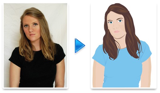
Everybody loves to take a "SELFIE"! This week we will work on 'vectorizing' real photographs. Vector graphics is the use of geometrical elements such as points, lines, curves, and shapes or polygons—all of which are based on mathematical expressions—to represent images in computer graphics.[1] Vector graphics are based on vectors (also called paths or strokes), which lead through locations called control points or nodes. (*adapted from http://en.wikipedia.org/wiki/Vector_graphics)
DIRECTIONS
1. Look at the examples below of this week's project.
2. Choose a selfie photograph or a photo of a real person (someone else).
3. Save the image to your flash drive as Last Name_First Name_Selfie Photo.
4. Import the image into Inkscape.
5. Set up Document Properties: US Letter Size 8.5 x 11"
6. SAVE AS: Last Name_First Name_Vector Selfie
7. Watch YouTube Video "How To Vectorize Self-Portraits & Selfies"
6. Set up Layers in Inkscape document.
7. Use Bezier Pen Tool to trace elements of photograph in the appropriate layer.
8. Re-Save!
Week of April 28-May 2, 2014
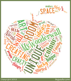
A tag cloud (word cloud, or weighted list in visual design) is a visual representation for text data, typically used to depictkeyword metadata (tags) on websites, or to visualize free form text. Tags are usually single words, and the importance of each tag is shown with font size or color.[2] This format is useful for quickly perceiving the most prominent terms and for locating a term alphabetically to determine its relative prominence. When used as website navigation aids, the terms are hyperlinked to items associated with the tag.
PROJECT DIRECTIONS:
1. Create a Tagul.com account.
2. Google the lyrics to a chosen song. (Must be made BEFORE 1999 & NO PROFANITY).
3. Use Ctrl+C to COPY, then Ctrl+V to PASTE the lyrics into the Tagul 'TEXT' tab.
4. Use the FIVE additional TABS underneath to customize your Tagul cloud. (Tags Source, Filter Common Words, Appearance, Fonts, Colors & Animations, and Grab & Share).
5. Save it to your Tagul account by clicking "Save Changes".
6. Finally, save it to your FLASHDRIVE as GD#_LastName_Firstname_SongCloud
*NOTE: You can monitor the changes you're making to your cloud by clicking "VISUALIZE" in the right corner!
Week of 5/12-16/2014

An album cover is the front of the packaging of a commercially released audio recording product, or album. The term can refer to either the printed cardboard covers typically used to package sets of 10 in (25 cm) and 12 in (30 cm) 78 rpm records, single and sets of 12" LPs, sets of 45 rpm records (either in several connected sleeves or a box), or the front-facing panel of a CD package, and, increasingly, the primary image accompanying a digital download of the album, or of its individual tracks.
In addition, in the case of all types of tangible records, it also serves as part of the protective sleeve.
Since the mid-1990s, the compact disc (CD) has become the most common form of physically-distributed music products. Packaging formats vary, including the very common plastic jewel-case, and the popular[citation needed] cardboard and plastic combination commonly known as a Digipak. Typically the album cover component of these packages is approximately 4.75 in square (12.1 cm square).
The cover became an important part of the culture of music at the time.The importance of cover design was such that some artists specialised or gained fame through their work.The talents of many photographers and illustrators from both inside and outside of the music industry have been used to produce a vast array of memorable LP/CD covers.
With the increasing popularity of digital music downloading services and the inflating cost of conducting business, the purpose and prevalence of the album cover is evolving. While the music industry tries to keep up with technological and cultural shifts, the role that packaging (and thus the "album cover") will play in consumer music sales in the near future is uncertain, although its role is certainly changing[citation needed], and digital forms of packaging will continue to surface, which, to some degree (and to some consumers) take the place of physical packaging. Both MP3 and WMA music files are able to contain embedded digital album artworks (called cover images or simply covers) in jpeg format. As of 2008[update], physical music products, with a physical "album cover", continue to outsell digital downloads.
One digital solution is the iTunes LP format for interactive album artwork introduced by Apple on 9 September 2009.
Album art is still considered a vital part of the listening experience to many, and despite the less-tangible nature of digital images, there are still many collectors trading cover art and music.
*Excerpt from Wikipedia.com
Project: Album Cover Shuffle
1. Click on the download file below "Album Cover Template". It will open a BLANK Internet Explorer page. Go to the "Settings" wheel in the right-hand corner. Choose "File" then "Save As" to save to your flash drive. Open INKSCAPE, then open the file.
2. Search for an original music album cover from an EXISTING artist/group. It must be a real cover. Import the original artwork image into your Album Cover Template. Place it within the BLUE guidelines on the LEFT side of the document.
3. Analyze the lyrical content of the original album. Brainstorm ideas for a NEW cover concept. The new cover should be YOUR OWN DESIGN. You may use elements from the original cover, however the design should be completely new! You may use a new photograph of the artist(s).
4. Inspire yourself by researching past covers from the particular artist/group. Get a 'feel' for their overall artistic feel. While you are designing, think about WHAT CHANGES you are making and WHY you are making them. You will need to submit a written reflection along with this project.
| album_cover_template.svg |
Graphic Design: Urban Circles (Juniors)

| Urban Circles.svg |
Circles
First we need circles. I never bother picking colors for base sets but keep it simple black and white.
For our Urban design we start with a fresh Inkscape canvas: a new document. Import the cicle set into the current document: File > Import (or use Ctrl+I) and open the circle set from the first part of the tutorial. This allows us to use the circles in a design without damaging the original. Move the set such that it is not on top of the document. If you already have a basic idea and colour scheme for your design, you could color the set to match. In this tutorial I will create a square design, with the powerful colors of bright green, chocolate brown with dashes of white and orange. These are trendy colours, and you will see them in many contemporary designs. If you have troubles picking colour schemes that work, just hop over to Kuler and have a look at colour schemes that others have created, or create your own just by selecting a base colour you like and using Kuler's basic modes.
Circle composition
Anyways... like I said.. I decided to use a bright green. I recoloured the circles and then placed them on the canvas in a random order, randomly resizing and repositioning until I liked the composition. Hold down both Shift and Ctrl when resizing as it scales the elements uniformly and from centre. I started with the circles as they will be the focal point of the drawing, and if the composition is bad there, the drawing will not be too good when completed either.
In designs like these I make use of layers. There is no written law on how to segment any drawing in layers, and I just use layers by element type or colour groupings. It makes it easier to organise work and to hide and show elements is as easy as hiding or showing a layer. Open the layer manager, click the + symbol to create a new layer, name it circles and create it below the current one - which is Layer 1 by default and now holds our circle elements. Select the circle composition and use Shift + Page Down (or the move option in the Layer menu) to place it on the newly created layer.
Brown Cloud
Next step is creation of a layer to hold a a darker element which serves as a background against which the circles are displayed. This cloud will be created from the outlines of our circle composition, so it makes sense to use a duplicate of this layer.
We are almost up to making the white clouds, but as our drawing background is white, they will disappear. Create a layer for the background below the brown clouds layer. Draw a simple rectangle that is large enough to be a background for your design. Hold down Ctrl to scale uniformly. Give it any fill you like, we'll tweak it later.
White Clouds
Then the white clouds. As you may have guessed, they are similar to the brown cloud, so select the brown cloud layer again. As before, make a duplicate layer of the brown cloud layer, move it down one step and name it white cloud. Hide the circles and brown cloud layer. Recolour the brown to a white, and flip the element both horizontally and vertically. Make the other layers visible again to check results. Resize and reposition the white cloud to your likings. That was easy!
Floral Swirls
Create a new layer just above the white cloud layer and call it floral swirls. Swirls are easy to create and give a design a bit of swoosh. I hide all other layers while I create the swirls. We use a spiro curve here. Check my Spiro Swirl tutorial if you have no idea how spiro works.
Final TweakingsBackgroundNow let's spice up the background a bit. I chose a bright green matching the circles, but to make it more interesting I applied a radial gradient. I used white in the center and a green at the edges. Select colours that match your design and change the gradient to your likings.
Circle compositionThe circle design in all green is a bit plain, so I selected a few circles and changed the stroke to orange or white. I also filled the centre of some circles with orange. The circles are grouped, but you can select an individual element in a group by first double-clicking the group, and then selecting the element you want to edit.
Brown cloud drippingThe last step is to apply a filter to the brown cloud layer. Filter extensions are new in Inkscape. The filter editor has been around for a while, but now it is very easy to apply certain standard effects. Note that using filters in a design really slows down working in Inkscape, so it is a good thing to apply filters at the very last step. It also helps to zoom out quite a bit so not too much detail needs to be rendered. There are also some options to render lower quality on display, but high on export. Tweak these settings if Inkscape slows down too much to work with. The filter applied to the layer is Protusions > Dripping.
First we need circles. I never bother picking colors for base sets but keep it simple black and white.
- Just start drawing a circle using the circle tool, hold down the Ctrl-key to scale uniformly.
- Use Ctrl+D to duplicate a circle. The new circle will be directly on top of the original, and have the same centre point.
- Now scale the duplicate smaller or larger to your likings, hold down both the Ctrl-key and the Shift-key so scaling is uniformly and from the centre.
- Vary the stroke style and width to create different looks for each circle. Also make use of the toggle to either affect stroke scaling with the object scaling or not.
- Use a fill for the innermost circle in a few symbols.
- Typically 3-5 concentric circles are used in a symbol.
- When you complete a symbol, select all circles for that symbol and use Ctrl+G to group them.
- Save your designs in a seperate Inkscape file as part of your personal symbol library, ready for re-use in many designs.
For our Urban design we start with a fresh Inkscape canvas: a new document. Import the cicle set into the current document: File > Import (or use Ctrl+I) and open the circle set from the first part of the tutorial. This allows us to use the circles in a design without damaging the original. Move the set such that it is not on top of the document. If you already have a basic idea and colour scheme for your design, you could color the set to match. In this tutorial I will create a square design, with the powerful colors of bright green, chocolate brown with dashes of white and orange. These are trendy colours, and you will see them in many contemporary designs. If you have troubles picking colour schemes that work, just hop over to Kuler and have a look at colour schemes that others have created, or create your own just by selecting a base colour you like and using Kuler's basic modes.
Circle composition
Anyways... like I said.. I decided to use a bright green. I recoloured the circles and then placed them on the canvas in a random order, randomly resizing and repositioning until I liked the composition. Hold down both Shift and Ctrl when resizing as it scales the elements uniformly and from centre. I started with the circles as they will be the focal point of the drawing, and if the composition is bad there, the drawing will not be too good when completed either.
In designs like these I make use of layers. There is no written law on how to segment any drawing in layers, and I just use layers by element type or colour groupings. It makes it easier to organise work and to hide and show elements is as easy as hiding or showing a layer. Open the layer manager, click the + symbol to create a new layer, name it circles and create it below the current one - which is Layer 1 by default and now holds our circle elements. Select the circle composition and use Shift + Page Down (or the move option in the Layer menu) to place it on the newly created layer.
Brown Cloud
Next step is creation of a layer to hold a a darker element which serves as a background against which the circles are displayed. This cloud will be created from the outlines of our circle composition, so it makes sense to use a duplicate of this layer.
- Select 'Create duplicate layer' from the Layer menu.
- Rename the layer by double clicking on the layer name. I named it brown cloud.
- Move the layer below the circles layer.
- Hide the circles layer so it is easier to see what needs to be done.
- Select all the circles in the 'brown cloud' layer.
- Ungroup by using Shift + Ctrl + G. Do this multiple times until the message in the status bar reads that there are no groups in the selection.
- With all circles still selected, choose any fill colour (tho brown is a good option already) and remove the stroke (hold shift down while clicking the X in the colour pallette).
- Next select 'Union' from the Path menu. This will merge all objects into one.
- Now there are probably still a lot of large gaps. Use a few shapes (circles or rectangles) to fill these, and again use Union with all objects selected. This should result in a basic cloud with the same outline as the circle composition.
- Assign an appropriate colour to the element, I used brown.
- Make the layer with the circle composition visible and then scale the brown cloud a bit up so it forms a nice background.
We are almost up to making the white clouds, but as our drawing background is white, they will disappear. Create a layer for the background below the brown clouds layer. Draw a simple rectangle that is large enough to be a background for your design. Hold down Ctrl to scale uniformly. Give it any fill you like, we'll tweak it later.
White Clouds
Then the white clouds. As you may have guessed, they are similar to the brown cloud, so select the brown cloud layer again. As before, make a duplicate layer of the brown cloud layer, move it down one step and name it white cloud. Hide the circles and brown cloud layer. Recolour the brown to a white, and flip the element both horizontally and vertically. Make the other layers visible again to check results. Resize and reposition the white cloud to your likings. That was easy!
Floral Swirls
Create a new layer just above the white cloud layer and call it floral swirls. Swirls are easy to create and give a design a bit of swoosh. I hide all other layers while I create the swirls. We use a spiro curve here. Check my Spiro Swirl tutorial if you have no idea how spiro works.
- Select the bezier curve, set the mode to Spiro Path, set the shape to 'Triangle in' and draw a curly curve.
- After completion, select "Object to path" from the Path menu. This applies the path effects permanently and allows us to resize and rotate the path without funny side effects.
- Add a simple circle and use Union to combine both shapes.
- Create a few duplicates and resize / rotate / reposition them untill you have a nice branch, use Union again to make a single object.
- To create a longer branch, just place 2 of the branches on top of each other and use Union to make them into a single shape. Use the node editor to correct bumps where needed.
- Unhide the other layers.
- Colour the branches in the same colour as the brown cloud and place the branches randomly over the top half of the brown cloud. Duplicate, resize and rotate to your liking. Hide/unhide the other layers temporarily if they get in your way.
Final TweakingsBackgroundNow let's spice up the background a bit. I chose a bright green matching the circles, but to make it more interesting I applied a radial gradient. I used white in the center and a green at the edges. Select colours that match your design and change the gradient to your likings.
Circle compositionThe circle design in all green is a bit plain, so I selected a few circles and changed the stroke to orange or white. I also filled the centre of some circles with orange. The circles are grouped, but you can select an individual element in a group by first double-clicking the group, and then selecting the element you want to edit.
Brown cloud drippingThe last step is to apply a filter to the brown cloud layer. Filter extensions are new in Inkscape. The filter editor has been around for a while, but now it is very easy to apply certain standard effects. Note that using filters in a design really slows down working in Inkscape, so it is a good thing to apply filters at the very last step. It also helps to zoom out quite a bit so not too much detail needs to be rendered. There are also some options to render lower quality on display, but high on export. Tweak these settings if Inkscape slows down too much to work with. The filter applied to the layer is Protusions > Dripping.
Week of 5/27-30/2014
Our next project will focus on creating magazine covers. You will learn several skills including creating and arranging text, cropping images, adding barcodes, and refining your Bezier pen tool skills. To begin the process, click on the file below titled "Pen Tool Practice". YES, we've done this before; however you'll need to perfect these skills! Let's do it again.
| pentool_practice.svg |
| ebony_cover_template.svg |
